Pointing a region towards better health, better care and a brighter future
Yuma, Arizona is known as one of the sunniest places on Earth. It’s also home to a thriving local community and diverse population in a region with a rich history and promising future.
In the heart of Yuma, what was once a single hospital called Yuma Regional Medical Center (YRMC) is blossoming into an emerging health system as they expand their facilities and specialties across the region. As YRMC embraced this new chapter, they realized their brand no longer represented their future and the broader community they now serve. It was time for something new.
The name Onvida Health was a perfect place to start, with roots in the Spanish word “vida”, meaning “life.” Onvida Health captures the essence and energy of the people who provide the spark that makes this health system shine.
The brand’s new purpose, “building a healthier tomorrow,” inspired the vibrant visual identity and the grounded enthusiasm of the new brand voice. The spark in the “O” of the wordmark represents an arrow leading to a healthier tomorrow and the notion of bringing out the sun in everyone.
When MIT Medical found itself at an inflection point in its 116-year history and needed to communicate its expanded services, they turned to Monigle to develop a visual expression that accurately reflected its evolved role in the MIT community.
The ask
Through a completely new visual expression, ensure MIT Health’s brand communicates its comprehensive healthcare and well-being services while retaining a visual connection with the overall MIT brand.
The result?
A new brand reflecting the organization’s commitment to adapting to the changing needs of its community and remaining true to the intellectual and creative excellence that defines MIT.
Tucked into a remote corner of the Rockies, a former mining town in Colorado has become one of the world’s premier destinations for skiing, biking, boating, arts and culture. The Town of Telluride built a long-term strategy to ensure the community remains livable and sustainable for years to come. We were charged with crafting a hard-working visual identity that would do the same.
The previous identity was decades old, diluted by a slew of department logos and plagued by usability issues for varied signage and collateral. We built a new visual identity including a logo, with custom type and jagged peaks, to mirror Telluride’s rich landscape. Rounded out with a new color palette and T monogram, the rebrand gives the Town of Telluride the tools to shape their future as a global destination.
With a fresh new look in the recent years, Monigle is pumping out content on our socials every week. We create illustrations for holidays, growth opportunities and internal usage. Here are a few illustrations I’ve created for our growth teams for socials, trade shows and more!
Inspiring the next generation of athletes of all backgrounds and abilities with a refreshed visual expression that's as dynamic and passionate as they are.
Our recent visual expression work with Woodward, a destination summer camp experience dating back to 1970 with a legacy focus on gymnastics and cheer, empowered them with the brand evolution needed to accelerate their business ambitions.
Woodward's on a mission to empower and inspire the next generation of athletes with an enduring culture that resonates with its core while shifting perspectives for young and old alike.
Woodward's program focuses on the progression of each athlete by welcoming children of all skill levels, from beginner to advanced, to surpass their goals, have fun and feel welcomed into a community of a like-minded individuals. Our expression delivered a broad canvas stretchy enough to resonate with more inclusive participants and expanding worldwide destinations. We wanted everyone who interacts with the brand to see themselves–and all that they can achieve–reflected back like an exhilarating gateway of possibilities
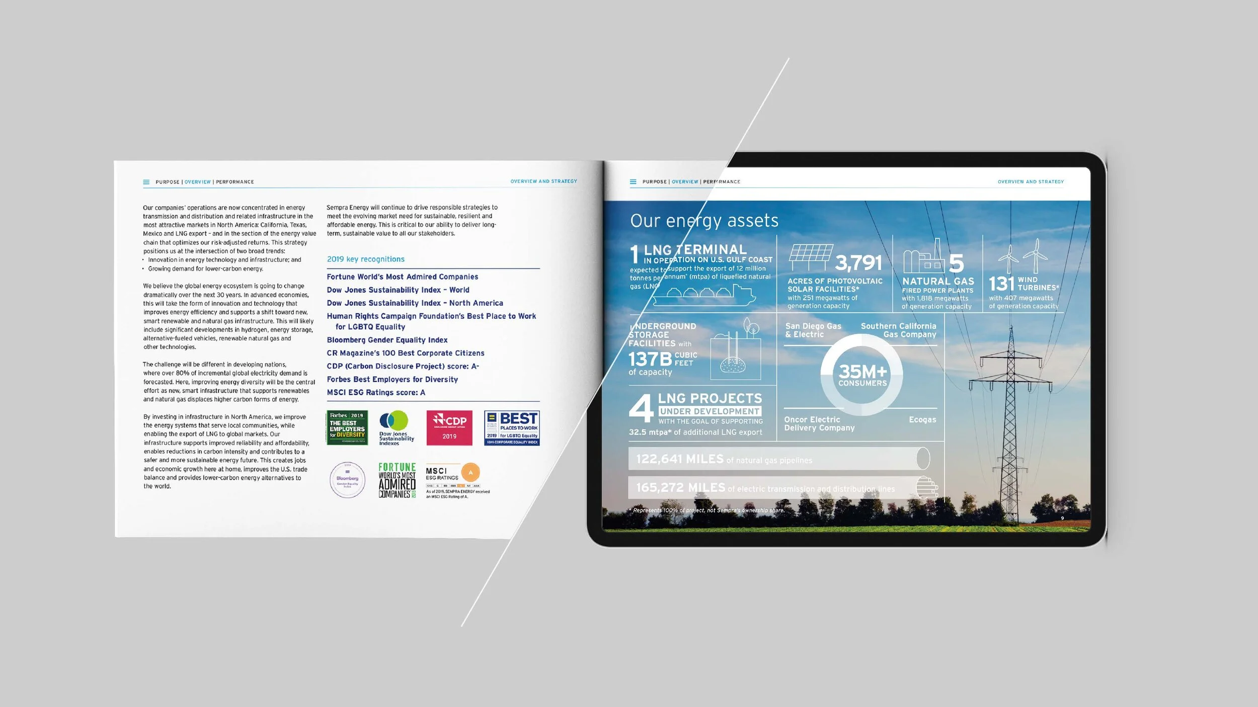
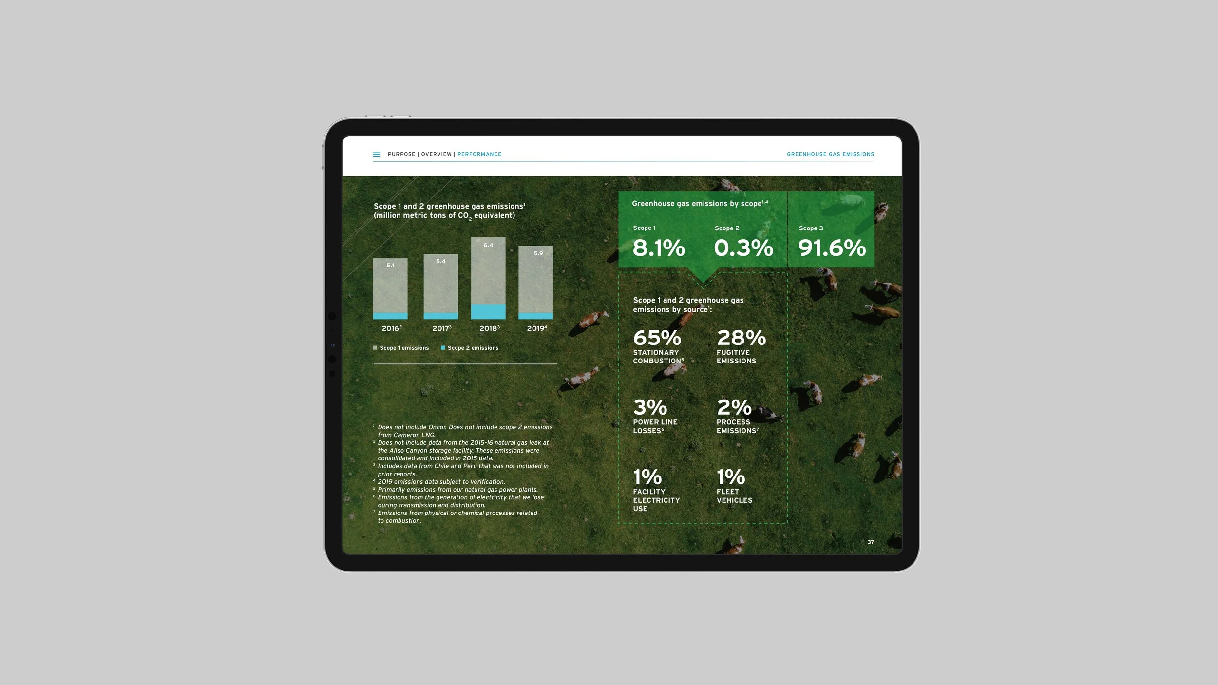
Sempra Energy is a North American energy infrastructure company based in San Diego, California. Sempra Energy's focus is on electric and natural gas infrastructure. Monigle accepted the daunting task to create Sempra’s 2019, 2020, 2022 Corporate Sustainability Report. I designed the report layout, illustrations, infographics, iconography, and photography while keeping the design aligned with Sempra’s current brand style. Under the art direction of Cody Ash we blew away the Sempra team with clear, creative and new design direction for all viewers to understand. This versatile CSR needed to work in both print and digital forms without any difference between the two. The digital version is interactive and can easily take the viewer to their desired page in one click. After creating the Sempra CSR we received more work from the Sempra team and continue to create the CSR reports every year.
Quest Diagnostics is an American clinical laboratory. Monigle works with Quest on many different projects within its organization but this one differs in being for the people. Quest came to us wanting a bold and eye-catching way to share their new initiative - to unite with others across the country to improve diagnostic testing for people in underserved communities—putting health in reach for all. Working with other Moingle team members on this project- lead by Jack Prettyman and Nina Janzon - we came up with a solution that unifies and stands out from the rest of the Quest brand. We introduced black and white photography which really helps portraits stand out and bring seriousness while pairing Quests’ brand colors in boxes to hold copy and headlines. The Quest team gave us the freedom to bring new creative work outside of the standard quest brand and they were extremely happy with the multiple options we brought to the table and the final result!
Transform Awards
Best visual identity by a charity, NGO or NFP
Silver – Quest Diagnostics and Monigle
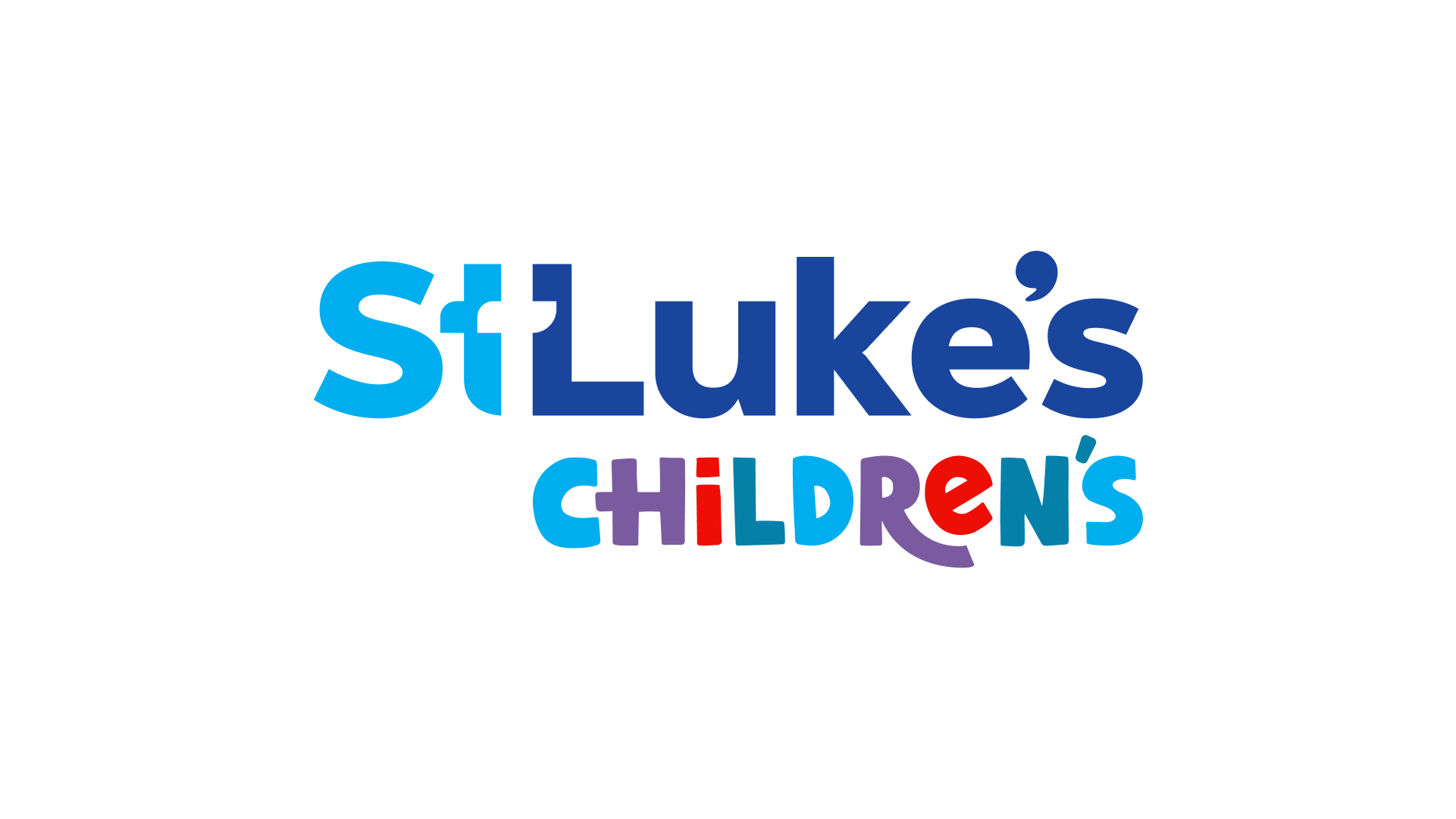
Concept designs for St. Lukes
Chasing the Unexpected
IFF had made a significant acquisition that changed the dynamic of their capabilities and reach by significantly enhancing their ability to deliver natural solutions. The challenge was twofold, how can we use brand to integrate two large companies under a single culture and purpose, and how can a reimagined IFF brand image and voice signal to the world that a new era of IFF innovation has begun?
Early category research showed that the world of large flavors and fragrances companies was safe and soft. All major brands were only talking about inspiration and emotion, supported by fluffy images of people sniffing the air and overdramatized depictions of their sustainability initiatives –there is so much more to talk about. We recognized an opportunity for IFF to stand out in every way – how they look, how they sound and especially how they make people feel.
We found the solution by grounding the brand in an honest realization – more of the same wasn’t good enough and the IFF difference comes from their freedom to chase the unexpected. It’s this type of thinking that gave birth to the mantra, Uncommon Sense. It’s more than a clever play on words, it’s a promise to reject convention and do more of what the world (and customers) needs.
Infinitree came to me before their launch of the Spa Living Collection in 2023. This unique spa furniture that fits around the hot tub needed a fresh new look on a low budget. Working closely with the client, we created a clean mark that can be represented on all branded materials. A clean, modern and functional design system can be used by all internal creative to bring this product to the public.